

Muriah Umoquit, Communications and Analytics Officer in the Cochrane Knowledge Translation department spoke with Mike Morrison, a Ph.D. candidate in organizational psychology at Michigan State University. Mike has worked with Cochrane to create conference poster templates that Cochrane members can use at the upcoming Cochrane Santiago colloquium and at other conferences they attend.
Hi, Mike. Can you tell us a bit about yourself so we have an understanding of how you are approaching academic posters?
I’m a PhD candidate in organizational psychology at Michigan State University. I come from a design background with expertise in industrial-organizational psychology.
What do you see as the purpose of academic posters?
Well ideally posters at conferences should serve as a jumping-off points for scientists to discuss their work. In an ideal word, you should be able to navigate the poster hall, find the posters that are most relevant to you, get new information from them, and then discuss further with the maker of the poster. Unfortunately the format of most academic posters prevents this from happening many times – which is frustrating for both the attendee and for the person presenting the poster.
I think any conference attendee can relate to this. Most academic posters follow the same format – the majority of the ones that I see look like the ones I made from 10 years ago. What’s wrong with them?
Academic posters really haven’t changed for many, many decades. I think the main issue with these posters are that they assume people are going to stand there and read our posters in silence for 10 straight minutes, following the order of the sections we've laid out. But with a rows and rows of posters, poster presenters asking if you have questions, and the buzz of poster sessions - that generally doesn’t happen. Most of the time you are just overloaded with a wall of text and chances are that you are missing out on information that could be important to your work.
Why are you so passionate about making conference posters better?
I see this as low laying fruit; this one aspect of scientific learning that can be changed dramatically with better design. I see it as a bottleneck to learning. If we can improve the learning efficiency with a better academic poster design, even by a tiny bit, we can help to uncork the bottleneck and create massive ripple effects across science. That’s exciting!
So what would make these posters better?
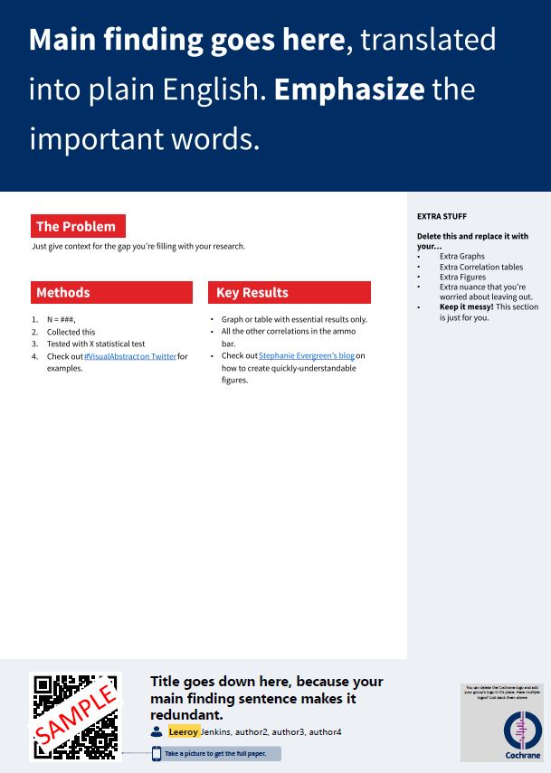
One that you pick out the important information as you walk by it in the poster hall but then also has the information you need if you want to stop and learn more. So a ‘better’ poster is one that puts the main finding in plain language as the main feature and overall has less text, less clutter, and is more user-friendly.
Tell us more about the design you came up with?
The template boils down the conference poster to just the essentials: a main finding, in big type and plain language; an "ammo bar" of data for presenters to use while they're talking to conference attendees; and a "silent presenter" bar with bullet points introducing the study, its methods and results.
It sounds great but is there evidence that this design works?
The #betterposer design has been well received by both those presenting and those viewing it. The response to poster design has been overwhelmingly positive, with some ‘top poster’ awards even given to these posters at conferences. An exit survey of attendees at a recent conference of all #betterposters found that 68 percent of attendees preferred even a plain #betterposter layout to the traditional poster design.
And those that don’t like it, what’s been the criticism of these templates?
Some feel that the approach is too extreme, say there is a lot of ‘wasted space’, or are worried that it still hasn’t been rigorously tested.
It a different approach to conference posters, so I understand that not everyone will ‘buy’ into it. But I encourage people to try it out for themselves next time they do a poster. Don’t start with everything and boil it down. Instead, use the #betterposter template to start with the essentials, and add in extra items only if really needed. I can guarantee that you'll learn something about what works and doesn't from trying the #betterposter layout, whether you decide to use it as your final poster or not - you can still use the traditional academic poster template that Cochrane has designed.
And you have adapted these #BetterPoster templates for Cochrane?
Cochrane has its main colours but all the Centres, Field, Review and Methods Groups all have ‘community’ colours in them. We have adapted the template so that each group can download the template colour they need to use and start adding in their data and Cochrane group logo.
The templates are even adjusted to the specific size requirements for Santiago Colloquium!
If Cochrane members would like to use these new templates, how can they?
You can download the poster template in your specific Community colours here:
- Cyan #betterposter template
- Green #betterposter template
- Magenta #betterposter template
- Orange #betterposter template
- Red #betterposter template
- Teal #betterposter template
Then just add your logo and data and you are set for the Colloquium or any other conferences that you presenting at.
How can Cochrane users help to determine if #betterposter templates are better than the traditional conference poster layout?
We are working on a larger evaluation of the design with both those who have used to the templates to create a poster and those who have viewed the design as a conference attendee. We will be inviting Cochrane members to participate in this after the Colloquium.
We are working on a larger evaluation of the design with both those who have used to the templates to create a poster and those who have viewed the design as a conference attendee. We will be inviting Cochrane members to participate in this after the Colloquium.
In the meantime, share your feedback and pictures of poster on social media with the hashtag #betterposter